I used a variety of different mediums to get the presentation that is shown below.
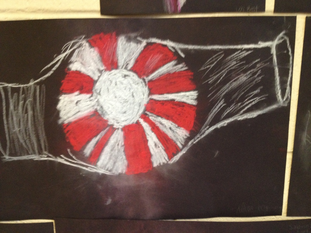
For the mint (shown above), I used Chalk pastel. I used the shavings to create the illusion that it was flying through the air. I achieved this by forcing the shavings to group at a specific spot and blowing them off of the page in the given direction. Looking back on the result,I feel that I could have done betterIn multiple ways, especially shading.
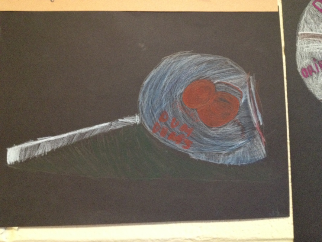
For the Dum-Dum lollipop shown above, I used colored pencil. I used bright, vibrant colors to achieve light sources, and transitioned to darker shades to accent shadow. Because shadows are shown using black, and I could not use black due to the color of the paper already being black, I chose green. I chose this because I felt it contrasted well with what was already there. I chose to contrast because I needed to give it some dimension, and create the illusion that it sat on a flat surface such as a table or a chair. I feel that I failed in that aspect. I should have drawn in the flat surface, rather than leaving it in as empty space. On the other hand, leaving it as empty space created some abstract quality.
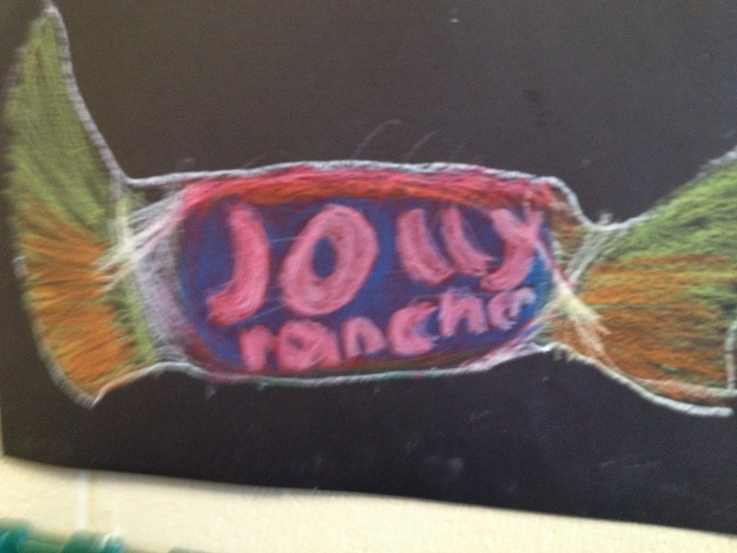
For the Jolly rancher, I used oil pastel. Oil Pastels blend much more easily than chalk pastels. This allowed me to create the illusion of depth that can be seen above. However, my ability to create the wrapper (as with the mint) is subpar at best. I think I could have done a much better job at creating depth, value and dimension. My job on creating a light source is slowly getting better, with dark/light transitions through out.
 RSS Feed