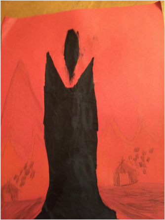
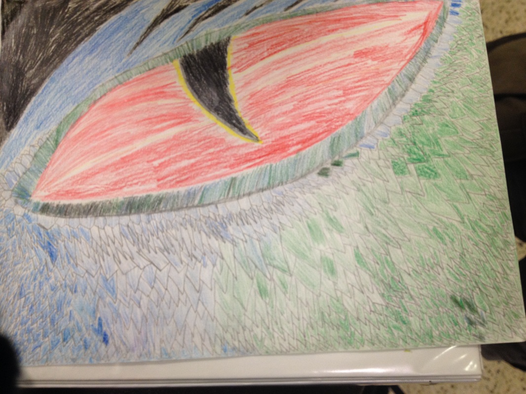
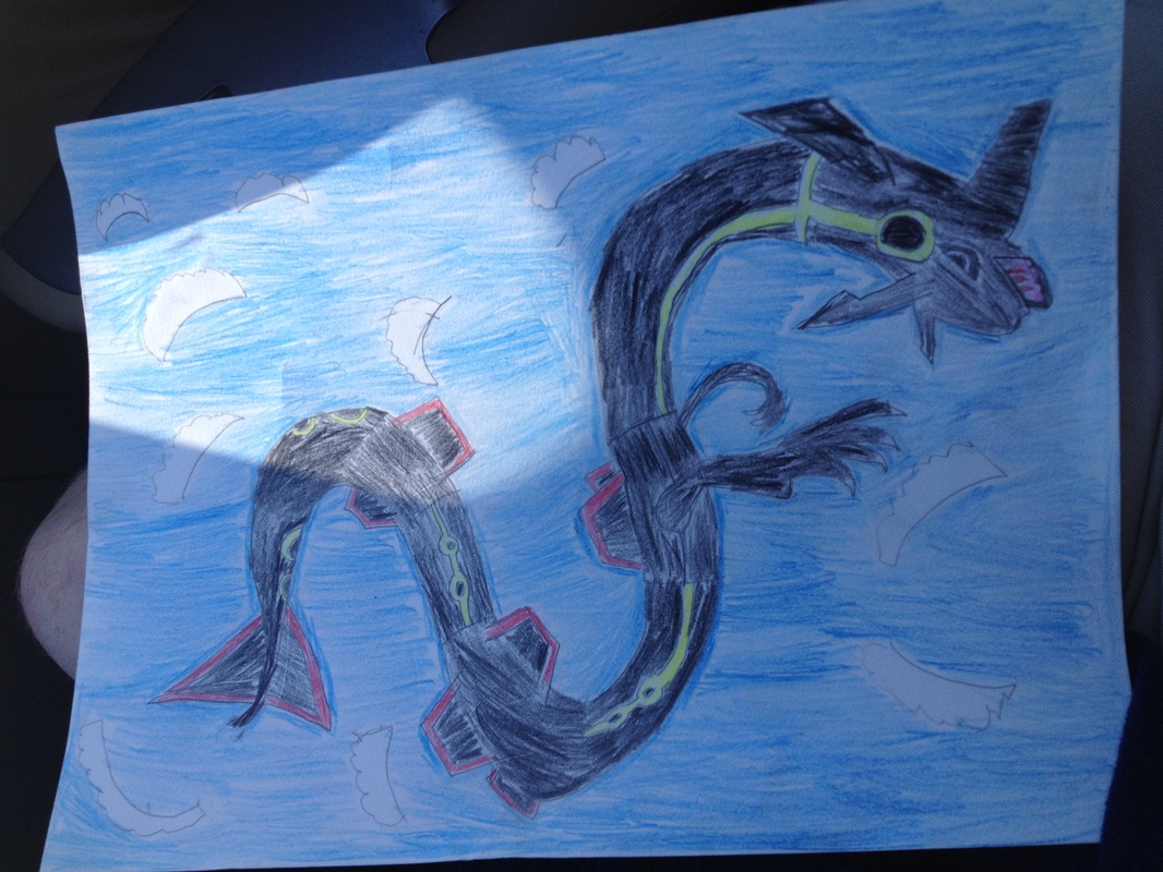
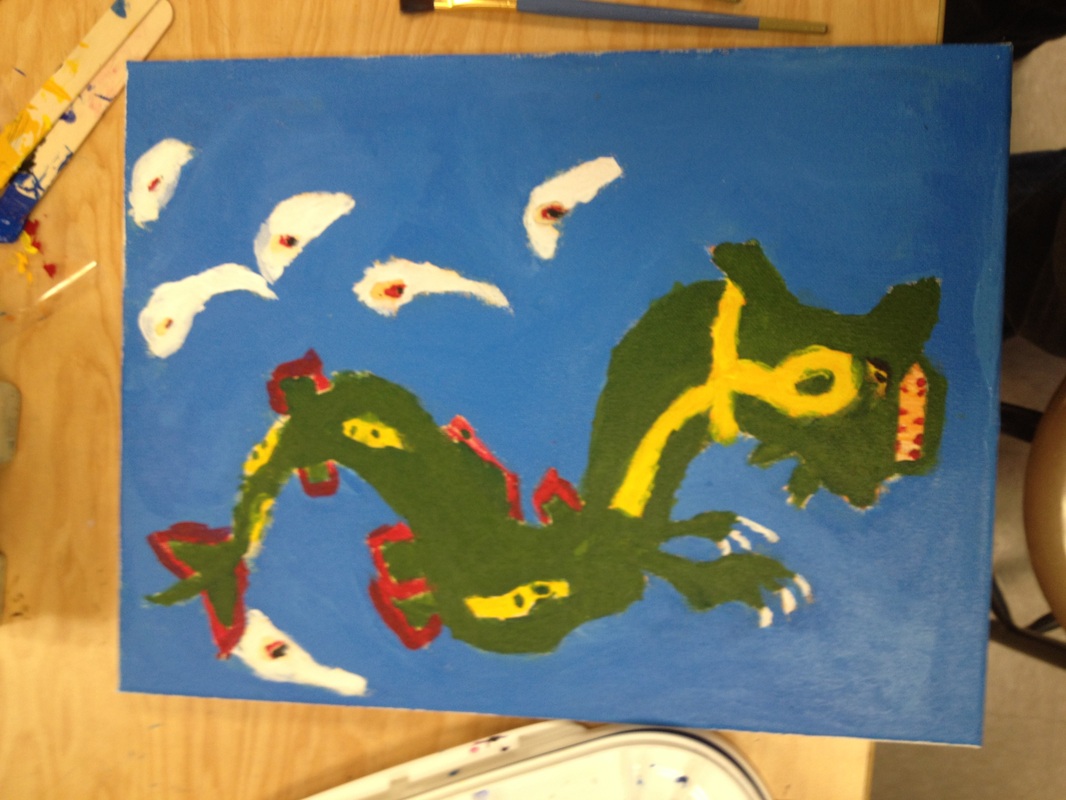
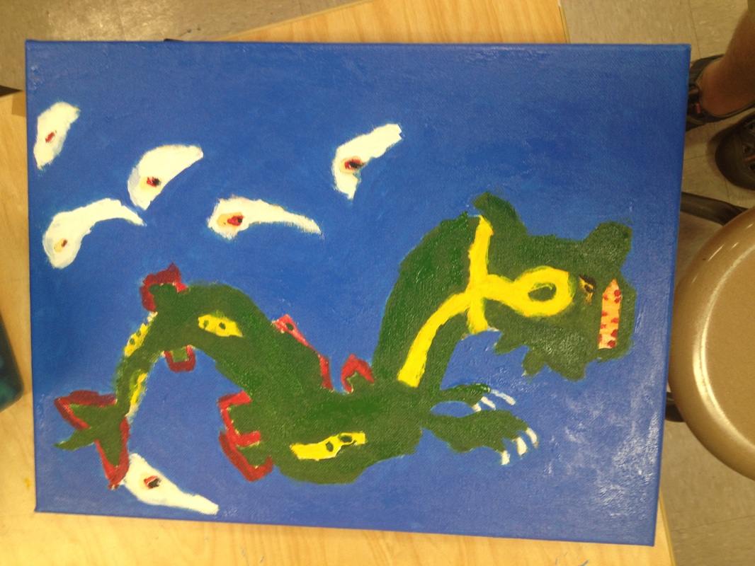
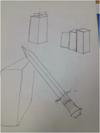
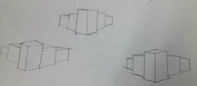
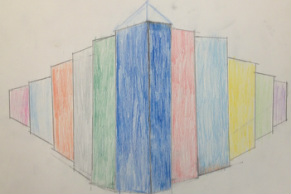
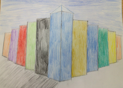
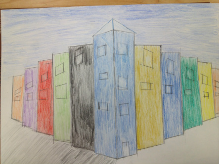
In this piece, we were tasked with creating an original work the was in tune with one of several themes. However, I do not think I did a good job with the project. Looking back, I could have done better. I could have added more, given it more detail, etc. I think part of the reason I didn't is because I may not have understood mixed media as a concept, but I under stood it as an art form.
In this piece, we were tasked with creating a piece of art in perspective that was close up and abstracted in some way. I chose to create something that was a little out of my limits, to push myself to improve. I created a close up of a dragons eye. I used two different colored pencil colors to abstract the piece by differing the scales (1/2 blue, 1/2 green). I attempted to utilize perspective techniques to round out the eye and make it look like it rounds out. I could have done better at that because it ended up looking like it caves in at the pupil. I did however, succeed at utilizing perspective to create dimension, as the dragon looks like it curves around like an actual dragons head would. I used black for the empty left over space around the dragon so I could make it look like it was flying at night. I achieved the desired effect by creating the hair like structures at the top of the dragon. I wish I could have spent more time on the project, because I felt that I could have corrected some minor faults had that been the case.
In this Piece, I made pizza and fries out of clay because the combination is one of my favorite things to eat. We were tasked to make realistic representations of the food we chose to make out of clay. Several students utilized glaze to do this. I however, chose to use paint, hoping I would be able to create a reasonable example of a well done project. To make the pizza I cut the shape out of a large block of clay and used some of the leftover clay to create the crust. I used some extra clay to cut out the fries. I used paint to create the realistic fries, and the crust and cheese of the pizza. I feel that while the paint job on the fries turned out OK, I could have done better. The paint job on the crust of the pizza and the cheese did not turn out as planned however, and I definitely could have done better. I say this because the crust turned out closer to blood red than a tan color that crust usually is. I did enjoy the project and I feel I put in my best effort towards the desired result.
I used a variety of different mediums to get the presentation that is shown below. For the mint (shown above), I used Chalk pastel. I used the shavings to create the illusion that it was flying through the air. I achieved this by forcing the shavings to group at a specific spot and blowing them off of the page in the given direction. Looking back on the result,I feel that I could have done betterIn multiple ways, especially shading. For the Dum-Dum lollipop shown above, I used colored pencil. I used bright, vibrant colors to achieve light sources, and transitioned to darker shades to accent shadow. Because shadows are shown using black, and I could not use black due to the color of the paper already being black, I chose green. I chose this because I felt it contrasted well with what was already there. I chose to contrast because I needed to give it some dimension, and create the illusion that it sat on a flat surface such as a table or a chair. I feel that I failed in that aspect. I should have drawn in the flat surface, rather than leaving it in as empty space. On the other hand, leaving it as empty space created some abstract quality. For the Jolly rancher, I used oil pastel. Oil Pastels blend much more easily than chalk pastels. This allowed me to create the illusion of depth that can be seen above. However, my ability to create the wrapper (as with the mint) is subpar at best. I think I could have done a much better job at creating depth, value and dimension. My job on creating a light source is slowly getting better, with dark/light transitions through out.
Below (in order): a rough draft/sketch, a pre-detailed painting, a post-detailed final product. Throughout the project, I had to keep in mind the source material and artist. Material in this case being Pokemon, and Artist being Takashi Murakami. Murakami is well known for giving animals and inanimate objects human like characteristics. Most common of these were eyes. But that is only part of his style. He draws almost every thing in a style similar to anime, which has become a huge part of the culture in japan.
Listed below (in order) are the references,sketches, composition sketches,final sketch, final piece, Final piece after extra detail is added. In the pictures above, I was planning, and deciding, what to draw for my final piece. At this stage, I wasn't yet sure what I wanted to draw.I had attempted to draw several things, such as Police box and sword and a computer. I was full of ambition and unable to realize what I could do with in the limits of my artistic ability. In the end, I decided to use the simple box shape as I knew that it was in the realm of my artistic ability. At this point, I had decided what to draw, and got feedback from my peers on which view point was the best. A straight view point( see middle) looked awkward, and would be difficult to add anything to. A birds eye view would be difficult to replicate and add to. So I decided to utilize a middle ground. I needed to practice drawing it before I copied the design to the final sheet. This helped me plan for the final designs color scheme. The glass triangular shape was added to give the design some more detail. It enhances the image by giving the building a architectural point of reference. At this point I had decided on a contrasting color scheme. This enables the viewer to see the precise details from building to building. Not only that, But shadows and a sky were added. And here is where the windows had been added. I decided not to add a surface to the drawing to add to the surrealism and illusion that the buildings are there, but at the same time, they aren't. Like the buildings them selves are a glimpse in to another dimension. Looking back on the final result, I think that I could have made several adjustments before considering it finalized. Most important is Coloration. More specifically, the buildings could have had more value than they currently have and the shadows of the buildings could have been done better.
|